Overview
New immigrants navigating Canada's immigration system are prime targets for scams and bad advice. Mipathia is a three-sided marketplace that connects them with reputable, vetted immigration lawyers and consultants, shows them their whole journey in one place, and brings employers into the system, because a job offer moves an application forward.
The challenge
Immigrating to Canada means navigating a dense, regulated system in a language that may not be the users first, with their future depending on getting it right. That pressure creates a market for help, and a market for scams. Fake consultants, inflated fees, and bad advice cost newcomers money they can't spare and, sometimes, their immigration outcome.
The challenge was to design a single system that could take in a person's full history, check it against Canada's immigration points system, surface every pathway they qualified for, federal and provincial alike, and then let them decide, with that information in hand, whether to connect with a vetted professional. Each piece alone is a data problem. Together, done for someone under real pressure and at risk of being taken advantage of, it becomes a trust problem.
The design methodology
Mipathia was built using a lean, continuous adaptation of the Double Diamond design framework. Working within tight budget constraints, we couldn't run a single, massive upfront Double Diamond cycle. Instead, we ran rapid, lightweight Double Diamond loops back-to-back ensuring we were constantly discovering the right problems while continuously delivering the right solutions.
Each sprint loop moved through four focused phases:
- Discover: We opened up the first diamond by gathering continuous user signals—synthesizing support tickets, direct feedback, and live behavioral analytics to capture real-world pain points.
- Define: We rapidly narrowed down those inputs to pinpoint the most critical user need, forming a clear design objective without long, traditional research delays.
- Develop: Moving into the second diamond, we explored focused, lightweight solutions, developing just enough UX context to build and prototype responsibly.
- Deliver: We shipped the feature, monitored live usage through Hotjar and behavioral metrics, and evaluated the impact.
Those delivery insights immediately fed into the Discover phase of the next diamond. This iterative loop was the core mechanism behind over two years of continuous updates ensuring Mipathia was never statically "done," but constantly evolving wherever user evidence pointed next.
The users
Our research gave us two anchor personas on the applicant side. Zayan, a professional in his late twenties looking to immigrate for work: enough money to proceed, no idea whether he needed a consultant or what one should cost. Prisha, around the same age, planning a move with her family: overwhelmed by the number of programs and unable to tell which information online was current or true.


Applicants couldn't find one place that showed the whole journey, and they couldn't tell who to trust.
Designing for three sides at once
Applicants were only one third of the system. Vetted immigration professionals use Mipathia to find and support clients, and employers use it to reach candidates through a built-in job board. Three audiences with different goals, different permissions, and different journeys, all sharing one platform.
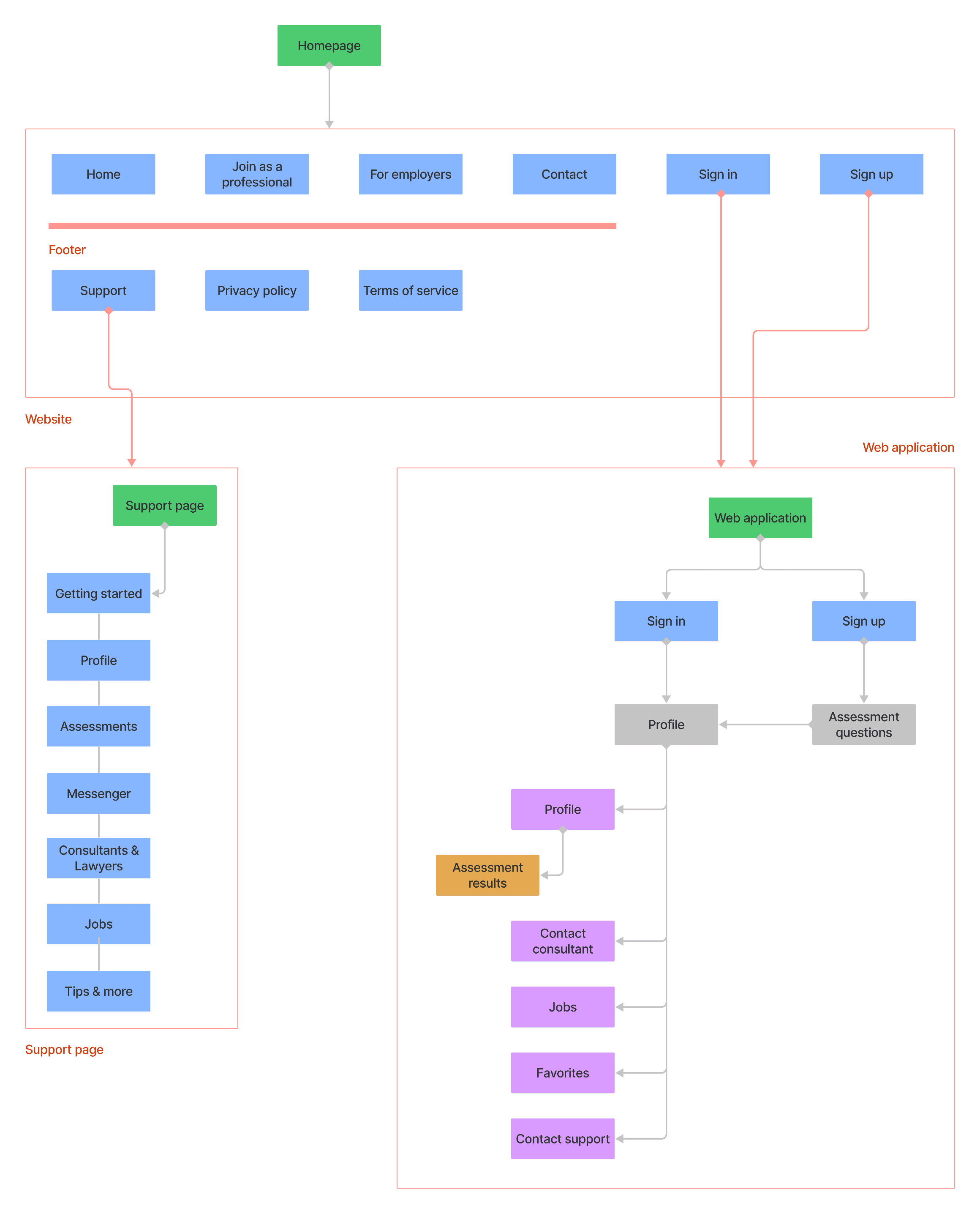
That made information architecture the hardest early work. Immigration isn't linear, and a three-sided marketplace multiplies every structural decision: what an applicant sees, what a professional can access, where an employer's job posting meets an applicant's profile. I mapped the full sitemap and user flows for the website and the web application before any interface work, because in a system this dense, the structure is the design.
Our competitive analysis confirmed the gap this filled: government sites had forms, forums had anecdotes, consultants sold services. Nobody covered the journey end to end, and nothing connected the three audiences who all had a stake in one application succeeding.
Watching real behaviour
We used Hotjar to observe how people actually moved through the product: where they hesitated, what they ignored, where they dropped off. That evidence loop ran through the whole project, before launch and long after it, and drove iteration on key flows once real users arrived.
Impact
Mipathia shipped and ran in production for over two years with continuous updates, which in product design is its own verdict: the design held up against real users, real content, and real change across all three sides of the marketplace. The design system carried new features without redesign, and the evidence loop meant iteration was driven by behaviour rather than opinion.